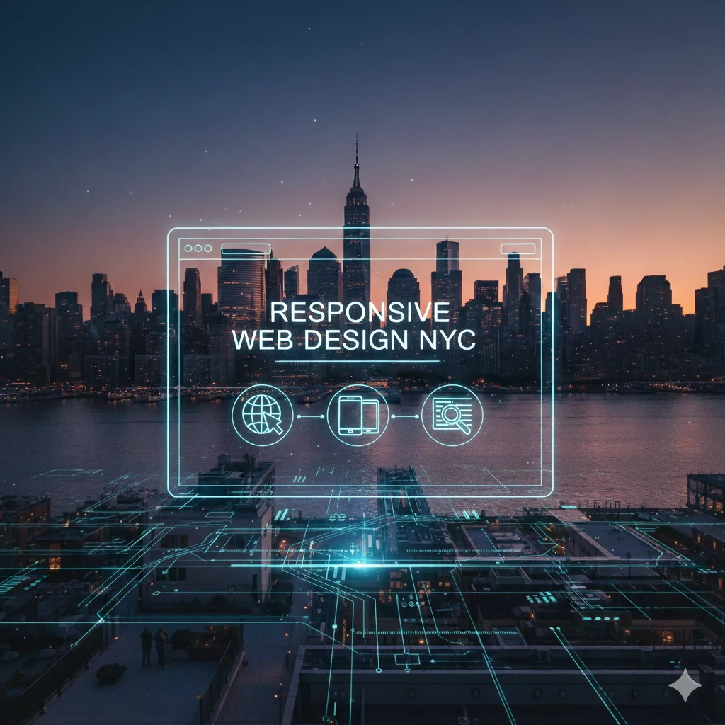
Responsive Web Design NYC | Mobile-First Website Development | GoodBrand Studio
In a city where smartphones are extensions of people’s hands and digital interactions happen on the go, a mobile-friendly website is no longer optional—it’s essential for survival. At GoodBrand Studio, we specialize in responsive web design NYC that ensures your website delivers a flawless, optimized experience across every device, screen size, and orientation. We don’t just shrink your desktop site; we architect mobile-first digital experiences that engage users, improve search rankings, and drive conversions in New York’s on-the-move marketplace.
Why Responsive Design is Critical for NYC Success
With over 60% of web traffic coming from mobile devices in urban areas like NYC, responsive design is your first line of defense against lost opportunities. It directly impacts your business through:
Google’s Mobile-First Indexing: Google primarily uses the mobile version of your site for ranking. A non-responsive site is penalized in search results, harming your SEO services NYC efforts.
Enhanced User Experience (UX): Visitors expect seamless navigation whether they’re on a subway, in a café, or at their desk. Responsive design meets them where they are.
Increased Conversion Rates: A frustrating mobile experience leads to immediate bounce. Responsive sites keep users engaged and more likely to convert.
Future-Proof Investment: One responsive site adapts to all current and future devices, eliminating the need for separate mobile sites or constant redesigns.
What Makes Truly Responsive Web Design Different?
Responsive design is more than just fluid grids. It’s a comprehensive approach to creating flexible, intelligent web experiences.
Fluid Grid Systems: Elements proportionally resize based on screen width, maintaining visual harmony.
Flexible Images & Media: Assets scale appropriately without breaking layout or slowing load times.
CSS Media Queries: Detect device characteristics and apply tailored style rules for optimal presentation.
Mobile-First Philosophy: We design for the smallest screen first, then enhance for larger devices—ensuring core content and functionality are prioritized for mobile users.
Our Mobile-First Responsive Design Process
We approach responsive design as an integral part of the overall user experience, not an afterthought.
1. Mobile-First Strategy & Content Prioritization
We start by identifying the core content and actions mobile users need most. This forces critical thinking about information hierarchy and ensures essential elements aren’t buried on smaller screens. This strategy aligns with content strategy NYC principles focused on user intent.
2. Responsive Wireframing & Prototyping
Before visual design begins, we create interactive wireframes that demonstrate how the layout will transform across breakpoints (phone, tablet, desktop). This focuses on functionality and user flow, a key component of our UX UI design NYC services.
3. Flexible Visual Design & Development
Our creative design NYC team creates visual systems that work at any scale. Our website development NYC team then implements using modern frameworks (like CSS Grid and Flexbox) that are inherently responsive, ensuring the final site is both beautiful and technically robust.
4. Rigorous Cross-Device Testing
We test on a vast array of real devices and emulators—from the latest iPhone to various Android tablets and desktop screens—to guarantee perfect performance everywhere. We also test touch interactions, swipe gestures, and mobile-specific functionalities.
Key Benefits of Responsive Web Design for NYC Businesses
Investing in professional responsive design delivers measurable advantages:
Superior SEO Performance: Google explicitly recommends responsive design. It consolidates your SEO efforts to one URL, avoiding duplicate content issues and building stronger domain authority.
Improved Site Speed & Core Web Vitals: Responsive sites, when built correctly, load faster on mobile—a direct ranking factor and user satisfaction metric.
Lower Maintenance Costs & Effort: Managing one responsive site is far more efficient than maintaining separate desktop and mobile sites.
Consistent Brand Experience: Your brand identity NYC and messaging remain cohesive, building trust regardless of how customers find you.
Higher Social Sharing Engagement: Responsive content is more likely to be shared and viewed correctly on social platforms, enhancing social media marketing NYC results.
How Responsive Design Integrates with Your Digital Ecosystem
Responsive web design is the technical foundation that supports all other digital marketing channels:
Paid Advertising: Ensures landing pages from PPC advertising NYC campaigns convert mobile users effectively.
Email Marketing: Guarantees newsletters and promotional emails link to pages that work perfectly on any device.
Content Marketing: Makes your content creation NYC accessible and readable everywhere, increasing engagement and time-on-site.
Local SEO: A mobile-friendly site is critical for capturing “near me” searches, a dominant behavior in NYC.
Common Responsive Design Challenges We Solve
Complex Navigation on Small Screens: We design intuitive mobile menus (hamburger menus, tab bars) that are easy to use with a thumb.
Touch Target Sizing: Ensuring buttons and links are appropriately sized for finger taps, not mouse clicks.
Image Optimization for Speed: Implementing techniques like lazy loading and next-gen formats to maintain visual quality without sacrificing performance.
Form Usability: Redesigning forms for mobile input, with appropriate keyboards and streamlined fields.
FAQs About Responsive Web Design in New York City
What exactly is “mobile-first” design?
Mobile-first is a design philosophy where we start the design process for the smallest screen size (typically smartphone) and then progressively enhance the experience for larger screens (tablet, desktop). This ensures the core user experience is optimized for the device most people use, rather than treating mobile as a scaled-down afterthought.
How do I know if my current website is truly responsive?
The simplest test is to open your site on a phone and desktop and see if the layout adjusts smoothly. However, true responsiveness involves more than just fitting. You can use Google’s Mobile-Friendly Test tool, or we can perform a comprehensive audit as part of our SEO audit NYC service.
Does responsive design cost more than a standard desktop website?
Initially, a responsive design project may require a slightly higher investment due to the additional planning, design considerations, and testing involved. However, it saves significant money in the long run by eliminating the need for separate mobile sites, reducing maintenance costs, and providing a better ROI through improved mobile conversion rates.
Can you make my existing non-responsive website responsive?
Yes, in many cases we can retrofit an existing site with responsive design through a web redesign NYC process. We assess the current codebase and structure to determine the most efficient approach—whether it’s modifying the existing theme/framework or recommending a rebuild on a modern, responsive platform.
Don’t let a poor mobile experience turn potential customers away. In NYC, mobile is the primary gateway to your business. Ready to ensure your website provides a flawless experience on every device? Contact GoodBrand Studio for a responsive design evaluation and proposal.